All of us have heard about technical analysis, but very few among average investors try to do it themselves. We leave it to the "experts" to play with the numbers or charts and give us those magical figures called resistance, support etc. Actually, technical analysis can be mastered with some effort and dedication. We plan to have a series of blogs that explain the basic funda behind technical analysis which can be easily understood. This is the first blog in that series. In this blog, we are trying to explain what technical analysis is and the basic graphs associated with it.
What is Technical Analysis?
The assumption for analyzing prices
Basic types of price charts
.
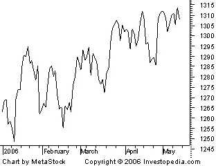
Closing Price chart
As you can see from the chart, a line chart can give the reader a fairly good idea of where the price of an asset has traveled over a given time frame. Since the closing prices are often seen as the most important ones to keep track of, it is not difficult to see why line charts have become so popular.
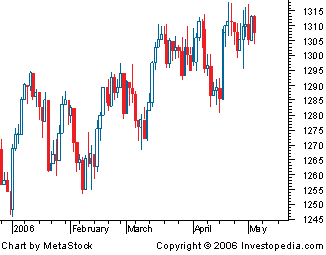
Bar Chart

Japanese candlestick charts
Edit --
Finahub is launching a gold jewellery design app called Finaura. The android mobile app enables you to find the best gold jewellery designs from the all the top jewellers across India. If you are into gold jewellery then this app is for you.
What is Technical Analysis?
Technical Analysis can be defined as a process of identifying trend reversal at an early stage and to ride the trend until the weight of evidence suggests that the trend has reversed directions. To study the trend or direction of price movement, the technical analyst studies the historic price and volume data with the help of charts.
The assumption for analyzing prices
- The market discounts everything. The price at which the security is quoted represents the hopes,fears,inside information,muscle power of the participants.
- The market moves in trend The market always moves in trends, and the trend when established has a tendency to continue further in time and the reverse at some point of time.
- History keep repeating itself This assumption arises from the fact that human psychology does not change. In a bull market the human psychology drives the prices up and the opposite in every bear market. In a different way it can be stated as mistakes made by traders on market will repeated again and again.
Basic types of price charts
There are three type of price chats generally used by technical analysis- the closing price chart, the bar chart, and the Japanese candlestick chart.
.
Closing Price chart
 |
| Price Chart |
A style of chart that is created by connecting a series of data points together with a line. This is the most basic type of chart used in finance and it is generally created by connecting a series of past prices together with a line.
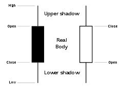
A basic type of chart, on which, as illustrated above, the top of the vertical line indicates the highest price a security traded at during the day, and the bottom represents the lowest price. The closing price is displayed on the right side of the bar, and the opening price is shown on the left side of the bar. A single bar like the one above represents one day of trading.
Japanese candlestick charts
A price chart that displays the high, low, open, and close for a security each day over a specified period of time.The candle will be White in color , if the closing price is higher than opening prices. And the color will be black if the closing price is lower than the opening prices.It is a combination of a line-chart and a bar-chart, in that each bar represents the range of price movement over a given time interval.
We will explain how to use these charts to find out Trend and Trend reversal in a later post. Do post your comments on this.
Edit --
Finahub is launching a gold jewellery design app called Finaura. The android mobile app enables you to find the best gold jewellery designs from the all the top jewellers across India. If you are into gold jewellery then this app is for you.